

Marvel
Online Shopping
At Disney, I did extensive work for Marvel, which in many ways was still an independent entity under the Mouse umbrella.
CHALLENGE ONE:
My first big Marvel project was when the Marvel online shop was brought in-house.
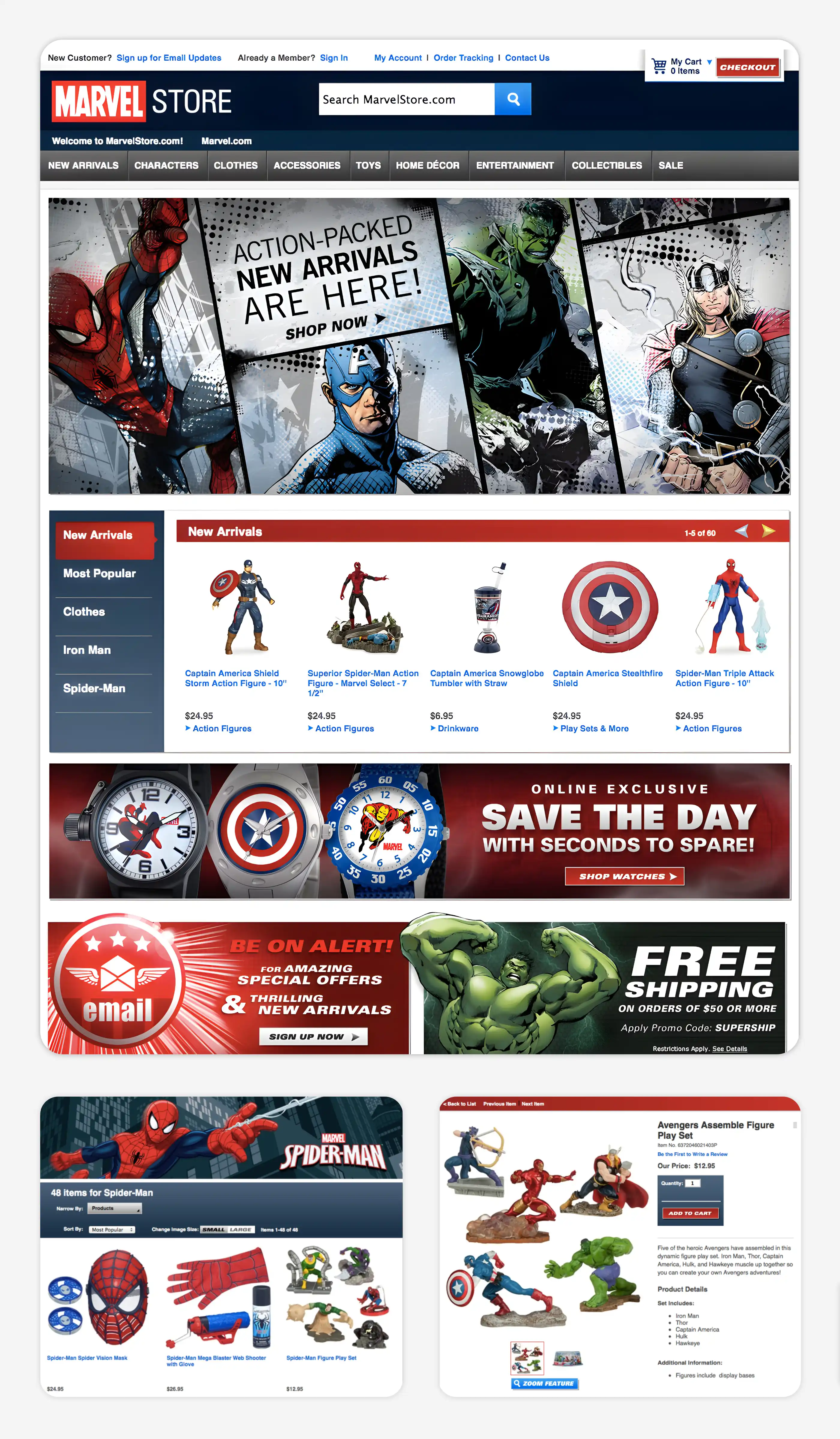
The existing site was dated and nobody in the building was happy with it, but engineering resources were limited. It was going to sit for at least a year and a half. The site had a fair amount of traffic, so nobody, executives included, was happy with that option.
I knew we could make the site better-–easier to use, a cleaner and more on-brand design–while requiring limited support on the server and database side.
I took the iniative to apply my skills: UX, Product, Front-End Dev, Visual & UI Design, copywriting....
MY ROLE:
The site functioned. But it was ancient, crusty, and the user experience was often frustrating because the UI spent more time “in the way” than helping.
I did a quick heuristic evaluation of the site for UX issues, then a more methodical assessment of the most important page templates: landing, product, categories, search, checkout. I assigned levels of effort to fixes: Low/Medium/High.
I crossed out all the Highs. Then anything requiring back end support, because our engineering team was small and fully occupied with our comprehensive Disney Store platform shift/site redesign/rebuild. (I had a bit of time because the UX and design process was in a long approval cycle as various stakeholders were being looped in.)
I started on my list of Lows and Mediums: sketching out possibilities, drawing up wireframes to clarify interactions, and mockups of a new visual look that could be executed with little engineering involvement.
ACCOMPLISHMENTS:
- Implemented new, modern visual design aligned to current Marvel creative
- Managed graphic asset production in partnership with digital creative
- Smoothed out UX bumps like weirdly hidden information, balky form design & validation, and 3-clicks-where-1-would-do
- Cleaned up code, including refactoring the world’s most annoying dropdown navigation so that it was usable by normal humans with normal human reflexes
- Sales increased immediately after the rework
CHALLENGE TWO:
The refreshed Marvel Store was then set aside for a year while we finished the reinvention of DisneyStore.com. Eventually, we began the migration of Marvel onto Disney’s new server and application architecture.
Our front-end team was allocated 5-8 months to rework Marvel to align with our new Disney Store UX and code. We finished in 3.
MY ROLE:
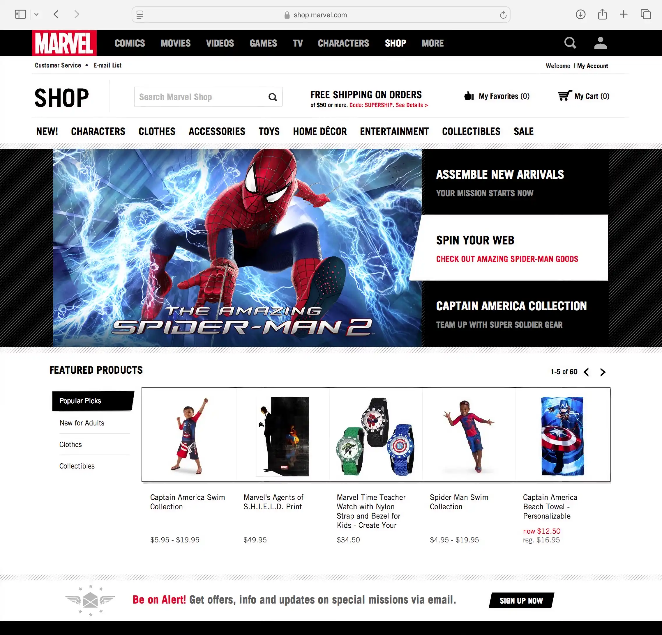
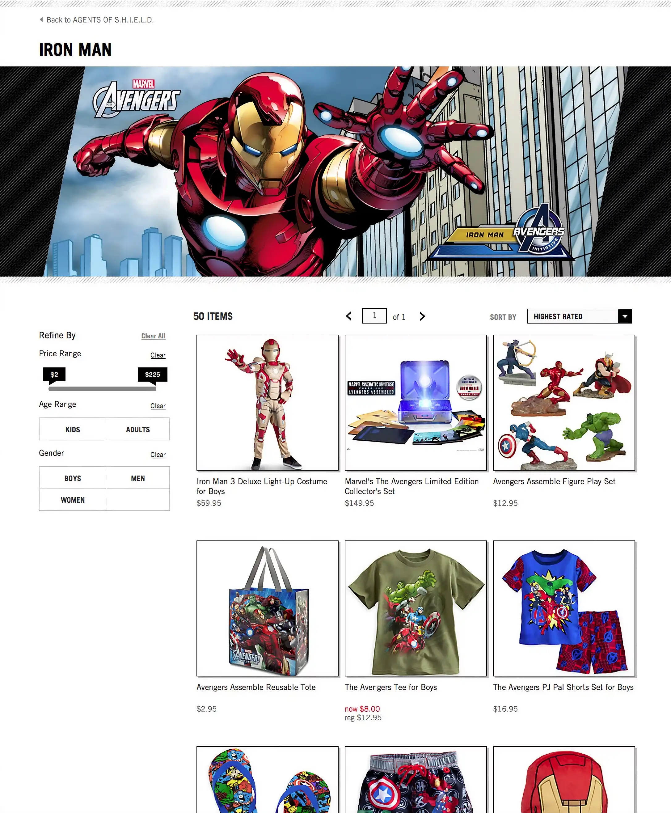
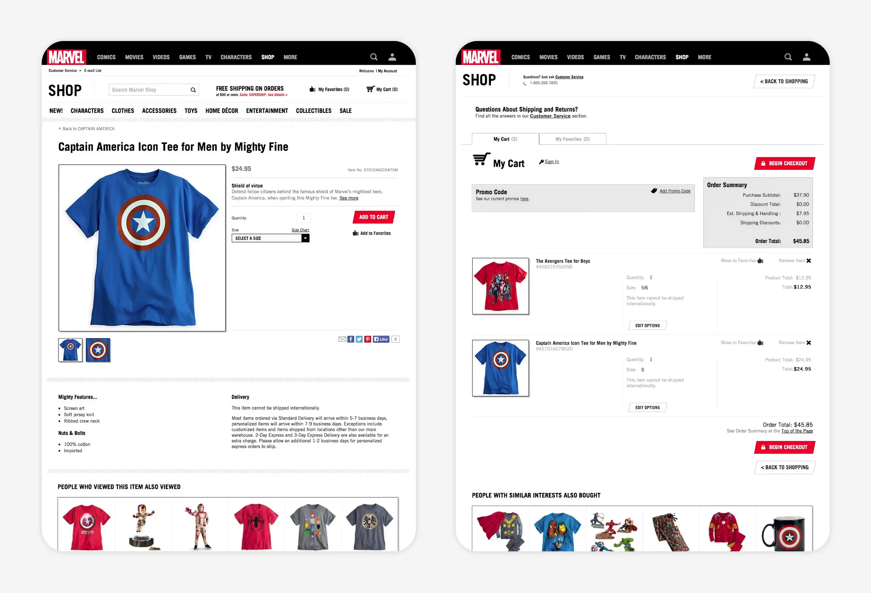
I led the effort to improve the product experience by harmonizing Marvel’s shop with our work on the Disneystore.com platform, while infusing Marvel branding into our new UI patterns and visual template.
Having served as the lead in re-architecting and coding the HTML, CSS, and language localization layers of the new Disney Store front-end stack, I managed the same parts of the Marvel port.
TBH, it was pretty easy–but only due to the work I’d put into making the Disney front-end layer flexible and a breeze to update. The site became more-or-less a “skin” of what we’d done prior for Disney Store USA, UK, Germany, and France.
Once the new Marvel-branded design was complete, all it took was CSS customization, a new webfont, some JSON files containing Marvel copy and UI text, and new graphic assets... and we had an all-new Marvel shop front end.
(NERDY TECHNICAL DETAIL ABOUT INTERNATIONALIZATION)
One thing I was particularly proud of was adding a front-end language localization layer, and the elegance of the solution. Previously, all UI text was held in old-school IBM databases per worldwide region, each site running on a separate, customized front-end stack. Every code change had to be made multiple times. Every copywriting or UI text update had to run through the database business owners, who processed updates on a schedule that seemed unconnected to conventional notions of time.
I implemented the new language layer via l10n (localization) and i18n (internationalization) Javascript principles. Currency, conventions, and text were moved into text files (JSON) and a simple interface created so non-developers could edit copy without code changes.
I extended the i18n principles to our CSS so images with baked-in text would display in the proper language. This meant that we were able to use a single front-end code base to support our international sites. (Checkout was more complicated, so it was better to keep cart and payment code separated by nation.)
Add a single nationality code to the html BODY tag (for example, “en-US”, “en-UK”, “de-DE”, “fr-FR”) and the JS app layer would populate the page with the appropriate language, allowing us to maintain a unified code base.
Gone were the days of updating multiple repositories with each change. And product owners in each country were delighted to have the ability to update site copy themselves.
ACCOMPLISHMENTS:
- All of my Product and UX work on DisneyStore.com flowed right onto MarvelStore
- Reduced international support costs by two-thirds due to efficiencies of unified global shopping architecture and design
- Front-end design and implementation finished months ahead of schedule
- My prior efforts at internationalizing and templating the Disney codebase allowed us to get the Marvel site up quickly, with minimal front-end code changes
- Product owners were now able to update UI and boilerplate text themselves, even more easily than they were able to update product descriptions
SELECTED WORK